
So, are they “Data Graphics” or “Infographics?”
Maybe you arrived at this post while searching for examples of “infographics” or “data graphics” or even “datagraphics” as they are also referred to. Regardless of which name you call them, you’ll find a few examples here. But, if you are interested in printing data graphics, then you’ve definitely come to the right place. First, let’s talk about the elephant in the room.
The name of our printing company is DATAGRAPHIC, which, yes, is also the word that some folks use to refer to an “infographic” (and visa versa). We’ve been in the printing business using this moniker for several decades and we sometimes get questions about the name from searchers who find us on the web. And while we may not design them, we certainly do have experience in printing them.
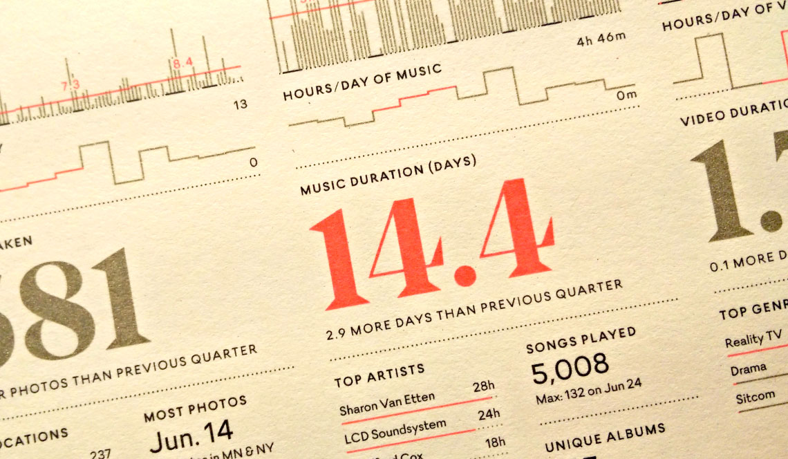
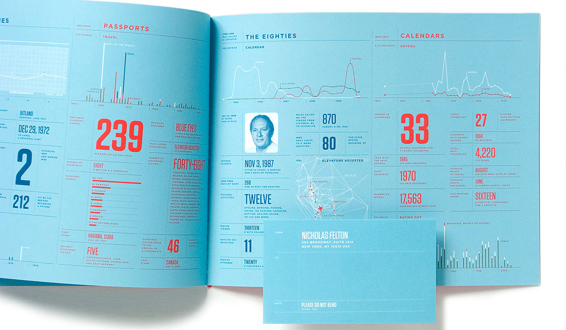
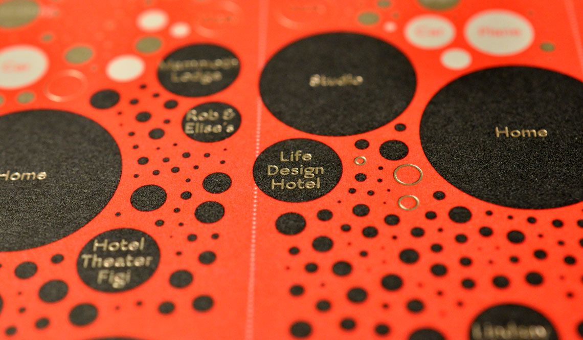
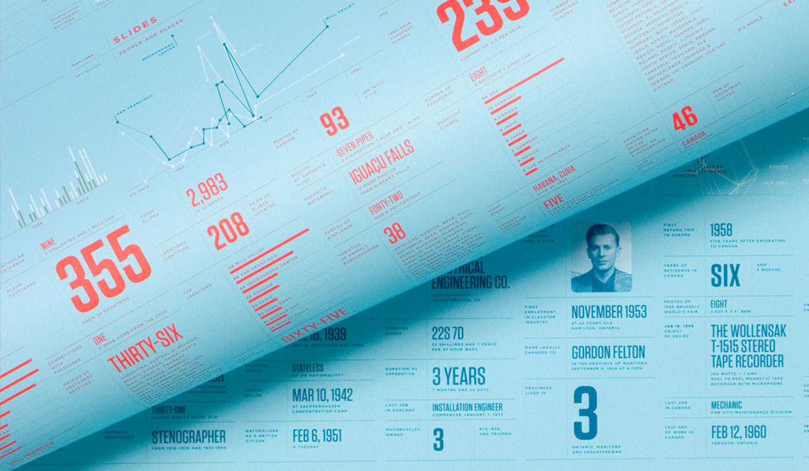
For those of you new to the concept, a data graphic is a type of illustration that is used to visualize data and make it easier to understand. Often times, these data visualizations contain many layers of information that can be viewed and compared all at once. They can appear alongside written information in books and other literature or as standalone printed images or posters. Some are so striking that they are hung on walls as art.
If you’ve designed a data graphic yourself, its purpose was probably to illuminate some specific topic or idea. And if you’re still reading this far, you possibly wish to print your data graphic in some form.
What’s the Best Printing Process for Data Graphics?
Printing data graphics can be a challenge, especially if they are large or complex or if your final printed dimensions are small. Below, we discuss the best practices for printing these unique designs, including how to choose the right printing process and paper. Whether you are printing your data graphic as a poster or in a book or other form there are many printing processes to choose from. Often, the format will help you determine which process is best.
Some data graphics are meant to be viewed as standalone pieces that can exist as a poster, for example. These are singular artifacts that allow you to use which ever printing process and paper stock that suits your design. Some data graphics are meant to illustrate a text and may appear in a book. These will likely just be printed along with the rest of the book in whatever printing process is best suited for the book’s contents.
Many data graphics contain charts or graphs that consist of intertwining solid colors. Printing processes such as letterpress and screen printing can produce highly readable and often stunning images that can make already interesting data pop on a poster. Data graphics that contain photography or other continuous tones such as gradients are better candidates for 4-color offset lithography or digital printing.
Which Paper is best for Printing Data Graphics?
The type of paper you use can greatly affect the quality of your finished design when printing data graphics. While some papers have a smooth finish, other papers have a textured surface, which could impact any fine line details or small type in your design. Generally speaking, the paper choice should add some aesthetic style to your final product while reproducing the information in the most readable manner possible.
Many papers are suitable for multi-process printing, which combines different types of printing such as offset and screen printing, engraved and foil stamping, etc. Very fine detail can be reproduced using any of these processes.
Tips for Printing Data Graphics
Ready to commit ink to paper? Here are some steps to getting your design printed:
- Decide on a format: standalone (like a poster or print) or book/booklet (if part of a larger work).
- Choose a printing process that best fits your budget and desired outcome.
- Select a suitable paper stock.
- Find an experienced printer.
So, yeah, that last part is us.
Ready to print your own data graphics?
Click here to request a quote for printing. We can help you choose the best processes and paper stocks to ensure your design is the best it can be.